WORKFORCE MANAGEMENT
End team inefficiencies with Zendesk
With Zendesk AI-powered workforce management, forecasting, scheduling agents, and tracking performance are a breeze.


BENEFITS
Organized employees are good for business


Improve productivity
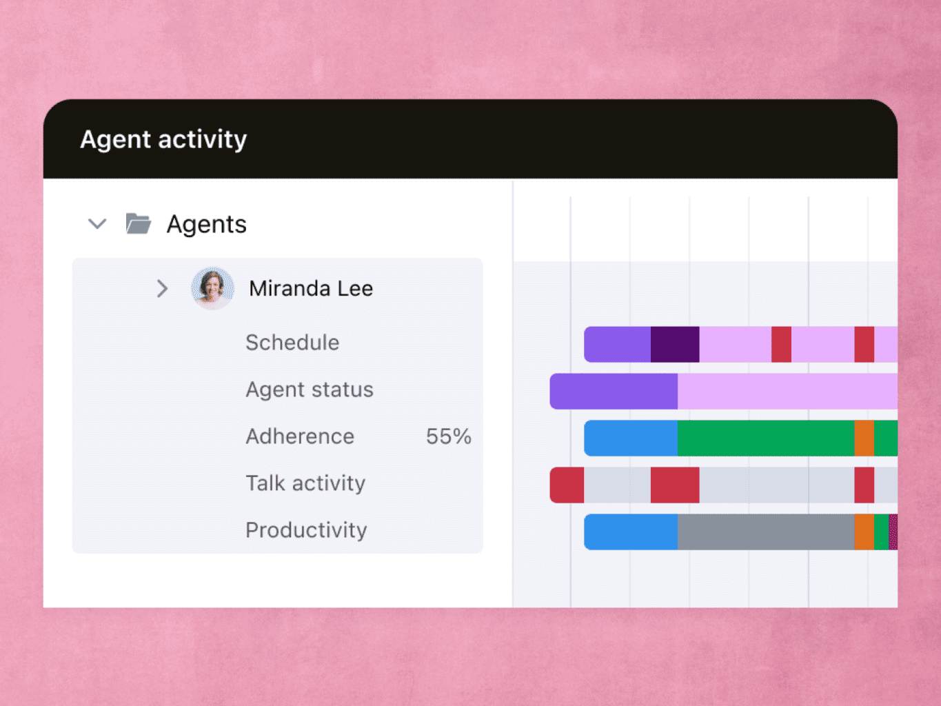
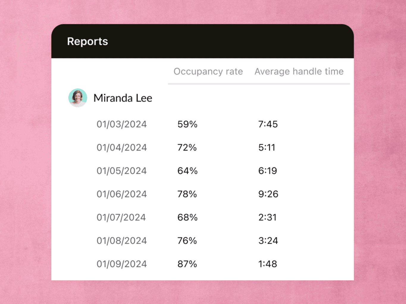
Performance reporting and real-time activity tracking show how agents spend their time, so you can lead a more efficient team.

Manage costs
AI-powered forecasting shows you exactly how many agents you’ll need, which reduces overtime and scheduling gaps.

Protect your time
With auto schedule, personalize each team member’s shift, saving time for both managers and agents.

Empower agents
Agents can view every task in advance, and they get in-depth insights into their work. Clarity cements team loyalty.
FEATURES
The simplest way to manage your staff


Zendesk analyzes your historical data to predict staffing needs in a given day, month, or season. Cut down on overtime costs and lower wait times.
testimonials


10x
Business growth
98%
Improvement in first call resolution
“We’re going to continue to chase technology and integrate AI into our customer support program. As long as Zendesk continues to be an innovator, we will continue to choose Zendesk.”
Chuck Courtney
Support Manager, Wyze Labs


Frequently asked questions
Right now, customers on any Basic or Suite plan can use Zendesk WFM. If you’d like to start a free trial, reach out to us here.